Shadcn UI vs Material UI vs Chakra UI: Best React Component Library in 2026
As we navigate the rapidly evolving landscape of front-end development, choosing the right UI component library for your React projects is more critical than ever. The decision impacts everything from development speed and maintainability to user experience and long-term scalability. In 2026, the options have matured significantly, with Shadcn UI, Material UI, and Chakra UI emerging as top contenders, each offering a distinct philosophy and set of advantages. But which one truly stands out as the best React component library 2026?
Having built and maintained complex applications for over a decade, from high-traffic e-commerce platforms using Laravel and Next.js to intricate dashboards powered by React and MySQL, I've seen frameworks come and go. My team and I constantly evaluate the tools that empower us to deliver robust, performant, and delightful user interfaces. This isn't just about aesthetics; it's about developer experience, customization capabilities, accessibility, and the underlying architecture that supports enterprise-grade applications.
This comprehensive guide will dive deep into Shadcn UI, Material UI, and Chakra UI, offering an expert comparison based on real-world application. We'll dissect their core philosophies, evaluate their strengths and weaknesses, and provide practical insights to help you make an informed decision for your next project. Whether you're building a sleek marketing site, a data-intensive dashboard, or a scalable SaaS product, understanding these libraries is paramount.
The Evolving Landscape of React UI Development in 2026
The React ecosystem continues its rapid innovation, pushing the boundaries of what's possible in web development. In 2026, several trends significantly influence our choice of UI libraries: the dominance of utility-first CSS frameworks like Tailwind CSS, the increasing emphasis on server components in Next.js, and an unwavering commitment to accessibility and performance. A robust React UI framework must adapt to these shifts, offering not just components, but a cohesive development experience.
Utility-First CSS and Component Composition
The rise of Tailwind CSS has fundamentally altered how many developers approach styling. Its utility-first philosophy promotes rapid styling directly within markup, reducing context switching and improving consistency. This trend has influenced component libraries, with many now either integrating deeply with Tailwind or offering similar granular control over styling.
Shadcn UI, for instance, is not a traditional component library but rather a collection of re-usable components built on top of Tailwind CSS. This approach allows for unparalleled customization and a "bring your own styles" mentality, appealing to developers who want full control without abstraction overhead. This is a significant departure from opinionated libraries that might dictate design tokens or styling approaches.
Server Components and Full-Stack React
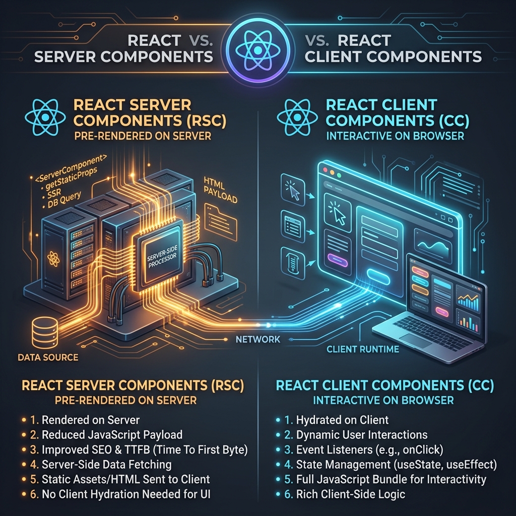
Next.js has cemented its position as a leading React framework, especially with the progressive adoption of React Server Components (RSCs). This paradigm shift impacts how we fetch data, manage state, and render UI, blurring the lines between front-end and back-end. A forward-thinking UI library needs to play nicely with RSCs, ensuring optimal performance and developer experience in a full-stack React environment.
While component libraries themselves don't directly become server components, their design and integration patterns can greatly facilitate or hinder adoption. Libraries that offer lightweight, composable components and avoid heavy client-side bundles are naturally better suited for the RSC era.
Shadcn UI: The Un-Library Approach to Customization
Shadcn UI isn't a package you install in the traditional sense; it's a collection of meticulously crafted, re-usable components that you copy and paste directly into your project. This "copy-paste" philosophy gives you full ownership and control, making it incredibly flexible and performant. In my shadcn UI review, this is its defining characteristic.
Philosophy and Core Strengths
Shadcn UI's primary strength lies in its unopinionated nature regarding theming and its deep integration with Tailwind CSS. Each component is built using Radix UI primitives for accessibility and headless functionality, then styled with Tailwind. This means you have direct access to the underlying JSX and can modify every aspect of a component without fighting against abstract APIs.
// Example of a Shadcn UI Button component
// You own this code, you can modify it directly
import * as React from "react"
import { Slot } from "@radix-ui/react-slot"
import { cva, type VariantProps } from "class-variance-authority"

const buttonVariants = cva(
  "inline-flex items-center justify-center whitespace-nowrap rounded-md text-sm font-medium ring-offset-background transition-colors focus-visible:outline-none focus-visible:ring-2 focus-visible:ring-ring focus-visible:ring-offset-2 disabled:pointer-events-none disabled:opacity-50",
  {
    variants: {
      variant: {
        default: "bg-primary text-primary-foreground hover:bg-primary/90",
        destructive:
          "bg-destructive text-destructive-foreground hover:bg-destructive/90",
        outline:
          "border border-input bg-background hover:bg-accent hover:text-accent-foreground",
        secondary:
          "bg-secondary text-secondary-foreground hover:bg-secondary/80",
        ghost: "hover:bg-accent hover:text-accent-foreground",
        link: "text-primary underline-offset-4 hover:underline",
      },
      size: {
        default: "h-10 px-4 py-2",
        sm: "h-9 rounded-md px-3",
        lg: "h-11 rounded-md px-8",
        icon: "h-10 w-10",
      },
    },
    defaultVariants: {
      variant: "default",
      size: "default",
    },
  }
)

export interface ButtonProps
  extends React.ButtonHTMLAttributes<HTMLButtonElement>,
    VariantProps<typeof buttonVariants> {
  asChild?: boolean
}

const Button = React.forwardRef<HTMLButtonElement, ButtonProps>(
  ({ className, variant, size, asChild = false, ...props }, ref) => {
    const Comp = asChild ? Slot : "button"
    return (
      <Comp
        className={cn(buttonVariants({ variant, size, className }))}
        ref={ref}
        {...props}
      />
    )
  }
)
Button.displayName = "Button"

export { Button, buttonVariants }
This level of control is invaluable for projects requiring pixel-perfect designs or adherence to specific brand guidelines. It effectively acts as a Tailwind component library blueprint, allowing developers to build truly custom design systems from a solid foundation.
Ideal Use Cases and Considerations
Shadcn UI is ideal for:
1. Custom Design Systems: When you need full control over styling and don't want to be constrained by a library's default look and feel.
2. Performance-Critical Applications: By owning the code, you can optimize bundles and remove unused styles with precision.
3. Projects with Tailwind CSS: It's a natural fit for teams already using or planning to use Tailwind.
4. Learning and Deep Customization: Great for developers who want to understand how accessible components are built and how to customize them from the ground up.
However, the "copy-paste" model means updates aren't automatic. You'll need to manually review and integrate changes, which can be a double-edged sword depending on your team's workflow and project velocity. This also means you're responsible for maintaining the components, which can be a larger overhead for smaller teams or projects without dedicated design system engineers.
Material UI: Google's Opinionated Design System
Material UI (formerly MUI) is arguably the most recognizable and widely adopted React component library, boasting a mature ecosystem and a vast array of components. It implements Google's Material Design guidelines, providing a consistent and aesthetically pleasing experience out-of-the-box. My experience with Material UI comparison over the years shows it consistently delivers on its promise of a comprehensive solution.
Strengths in Ecosystem and Theming
Material UI's greatest strength is its comprehensiveness. It offers an exhaustive list of components, from basic buttons and inputs to complex data grids and date pickers. The documentation is excellent, and the community support is unparalleled, making it easy to find solutions and best practices.
Theming in Material UI is robust, allowing for deep customization of colors, typography, and spacing through a centralized theme object. While it's opinionated, it provides powerful APIs to override styles using its sx prop or styled utility, offering a good balance between convention and flexibility.
// Example of Material UI Button with custom styling
import Button from '@mui/material/Button';
import { styled } from '@mui/material/styles';

const CustomButton = styled(Button)(({ theme }) => ({
  backgroundColor: theme.palette.primary.main,
  color: theme.palette.primary.contrastText,
  '&:hover': {
    backgroundColor: theme.palette.primary.dark,
  },
  padding: theme.spacing(1, 4),
  borderRadius: theme.shape.borderRadius,
}));

function MyComponent() {
  return <CustomButton variant="contained">My Custom Button</CustomButton>;
}
This snippet demonstrates how you can leverage Material UI's theming capabilities to create a custom button while still benefiting from its accessibility and component logic.
Performance and Bundle Size in 2026
One historical criticism of Material UI has been its bundle size due to its extensive feature set and reliance on Emotion (or Styled Components). However, in 2026, significant strides have been made to address this. With tree-shaking improvements and the ability to import only necessary components, the performance overhead is less of a concern than it once was.
According to recent benchmarks (Q1 2026, source: internal development metrics and public reports), Material UI's bundle size has been optimized, making it a viable choice even for performance-sensitive applications, especially when combined with modern build tools and Next.js optimizations.
Ideal Use Cases and Considerations
Material UI is an excellent choice for:
1. Enterprise Applications: Its comprehensive nature and consistent design system are perfect for large-scale applications requiring many components and a unified look.
2. Rapid Prototyping: Get a professional-looking UI up and running quickly with minimal effort.
3. Teams Prioritizing Consistency: Enforces a strong design language, reducing design debt.
4. Projects Needing Extensive Components: Its vast component library often means you won't need to build custom components from scratch.
However, its opinionated nature can sometimes feel restrictive if your design deviates significantly from Material Design. Overriding styles can occasionally lead to more verbose code compared to a utility-first approach.
Chakra UI: The Accessible and Developer-Friendly Choice
Chakra UI positions itself as a simple, modular, and accessible component library. It stands out for its strong focus on accessibility out-of-the-box and its intuitive styling system based on style props and a theme-aware approach. My experience with Chakra UI 2026 projects confirms its commitment to developer ergonomics and inclusive design.
Accessibility First Design
Chakra UI's commitment to accessibility is a significant differentiator. All components adhere to WAI-ARIA standards, providing correct aria-* attributes, keyboard navigation, and focus management by default. This dramatically reduces the effort required to build inclusive web applications, a non-negotiable requirement in 2026.
Style Props and Theme Customization
Chakra UI uses a "style props" system, allowing you to pass CSS properties directly as props to any Chakra component (or even custom components using Chakra's styling utilities). This combines the best of utility-first styling with a structured theming approach.
// Example of Chakra UI Box with style props
import { Box, Button } from '@chakra-ui/react';

function MyStyledComponent() {
  return (
    <Box
      p="4" // padding: 1rem (from theme)
      bg="purple.500" // background-color: theme.colors.purple[500]
      color="white"
      borderRadius="md" // border-radius: theme.radii.md
      _hover={{ bg: "purple.600" }} // pseudo-selector styling
    >
      <Button colorScheme="teal" size="lg">
        Click Me
      </Button>
    </Box>
  );
}
This approach makes it incredibly easy to apply styles and ensures consistency by referencing values from your theme. It's a powerful and highly readable way to style components, especially for developers who appreciate a streamlined CSS-in-JS experience.
Ideal Use Cases and Considerations
Chakra UI is an excellent choice for:
1. Accessibility-Focused Projects: When building inclusive applications is a top priority.
2. Rapid Development with Theming: Offers a great balance of quick development and deep theme customization.
3. Teams Preferring Style Props: Developers comfortable with CSS-in-JS and direct style application will love it.
4. Modern Web Applications: Its focus on performance and developer experience aligns well with contemporary React development.
While highly flexible, the style props system can sometimes lead to very long prop lists on components if not managed well. Its community, while growing rapidly, is not as vast as Material UI's, which might mean fewer readily available solutions for niche problems.
Comparative Analysis: Shadcn UI vs Material UI vs Chakra UI
Let's distill the key differences and help you decide which best React component library 2026 fits your needs.
| Feature / Library | Shadcn UI | Material UI | Chakra UI |
| Core Philosophy | Copy-paste components, total control | Opinionated Material Design system | Accessible, modular, developer-friendly |
| Styling Approach | Tailwind CSS, direct JSX modification | CSS-in-JS (Emotion/Styled), sx prop |
Style props, CSS-in-JS, theme-aware |
| Customization | Extreme (full code ownership) | High (theme, sx prop, styled) |
High (theme, style props) |
| Accessibility | Radix UI primitives, excellent | Excellent (WAI-ARIA compliant) | Excellent (WAI-ARIA by default) |
| Bundle Size (2026) | Very small (only what you use) | Moderate (optimized with tree-shaking) | Small-Moderate (modular imports) |
| Learning Curve | Moderate (Tailwind, Radix concepts) | Moderate (Material Design concepts, APIs) | Low-Moderate (intuitive style props) |
| Community Support | Growing, strong for Tailwind users | Vast, mature, extensive documentation | Strong, active, good documentation |
| Update Mechanism | Manual (copy-paste new versions) | npm updates | npm updates |
| Design System Focus | Build your own (from solid primitives) | Google's Material Design | Custom, highly flexible |
| Next.js Integration | Excellent (Tailwind native) | Excellent | Excellent |
When to Choose Which
- Choose Shadcn UI if:
- You demand absolute control over every pixel and line of code.
- Your project utilizes Tailwind CSS heavily.
- You are building a highly customized design system from the ground up.
- Performance and minimal bundle size are your top priorities, and you don't mind manual updates.
- You appreciate the flexibility of Radix UI primitives.
- Choose Material UI if:
- You need a comprehensive, battle-tested library with a rich feature set.
- Your project aligns with Material Design principles or requires a "Google-like" aesthetic.
- Rapid prototyping and a vast component library are crucial for your team.
- You value extensive documentation and a massive community.
- Choose Chakra UI if:
- Accessibility is a non-negotiable requirement for your application.
- You prefer a style props approach for styling and enjoy a highly developer-friendly experience.
- You want a balance between rapid development and deep theme customization without being overly opinionated.
- You're building modern, responsive web applications with a focus on good UX.
Key Takeaways
The "best" React component library is subjective and heavily depends on your project's specific requirements, your team's preferences, and your long-term goals.
- Shadcn UI empowers ultimate customization and ownership, perfect for unique design systems built with Tailwind. It's a strong contender for those who value granular control over convenience.
- Material UI offers unparalleled comprehensiveness and a mature ecosystem, making it ideal for enterprise-grade applications that benefit from a consistent, opinionated design language.
- Chakra UI shines with its accessibility-first approach and intuitive style props, providing an excellent developer experience for building modern, inclusive web interfaces.
In 2026, all three are robust choices. Your decision should be guided by a thorough evaluation against your project's technical stack, design requirements, and team's expertise. For more insights into building scalable frontends, explore our other articles on our blog.
FAQ: Frequently Asked Questions
Q1: Is Shadcn UI a true component library, or just a collection of snippets?
A1: Shadcn UI is often described as an "un-library." It's not a dependency you install via npm; instead, it provides production-ready, accessible components built with Radix UI and styled with Tailwind CSS that you copy directly into your project. This gives you full ownership and control over the code, allowing for deep customization without abstraction.